
Living with data visualisation
Helen Kennedy, Rosemary Lucy Hill, William Allen, Andy Kirk, Martin Engebretsen and others, Chris W Anderson, Giorgia Aiello
The main way that many people get access to increasingly ubiquitous data is through visualisations, which, like the data on which they are based, are increasingly widely circulated. As a result, we are witnessing an increased use of data visualization in a range of domains and genres. Data visualizations can be understood as:
‘graphical representations of data which are primarily, but not solely, numeric. What’s more, they are abstractions and reductions of the world, the result of human choices, social conventions, and technological processes and affordances, relating to generating, filtering, analysing, selecting, visualizing, and presenting data. Data visualizations (also called dataviz or DV) are created to ‘facilitate understanding’, to use Kirk’s term (2016, p. 19; see also Borgo et al., 2013; Cairo, 2013), but they also facilitate documentation, persuasion, and manipulation’.
(Helen Kennedy and Martin Engebretsen, ‘Introduction: The relationships between graphs, charts, maps and meanings, feelings, engagements’ in Engebretsen, M. and Kennedy, H. (eds) (2019) Data Visualization in Society, Amsterdam University Press, p. 10).
So just as citizens are increasingly required to ‘live with data’, so too we live with data visualizations. How do data visualizations impact on the way that people live, work and communicate? In what new social and cultural contexts are data visualizations emerging, and to what ends? We are undertaking a range of projects to explore how people ‘live with data visualization’.
Generic visuals in the news
Generic visuals in the news: the role of stock photos and simple data visualizations in assembling publics is a research project which will commence in 2020 and run for three years. It is led by Professor Chris W Anderson from the University of Leeds. Professor Helen Kennedy and Dr Giorgia Aiello are Co-Investigators on the project, which will be funded by the Arts and Humanities Research Council.
The project focuses on ‘generic visuals’ – that is, images which have standardized formats and appearances, which perform particular design functions and which circulate with increasing frequency in the news media, such as stock photos and simple data visualizations. The project investigates the role that generic visuals play in bringing groups of people together around shared interests and concerns, activating citizens to care (or not) about particular issues, making possible (or not) various forms of engagement, including democratic decision-making, and in spreading or inhibiting the spread of disinformation. We use the term ‘assembling publics’ to capture these various processes. Despite our increasing exposure to generic visuals, very little is known about the role that they play in relation to the assembling of publics. Research into visuals in the news has focused on iconic photos or award-winning data visualizations, and analyses of visual news media are therefore primarily studies of the spectacular. As a result, the mass of mundane images, or generic visuals, that surrounds us daily remains unacknowledged and under-researched. Our research aims to fill this gap.
Data Visualization in Society book
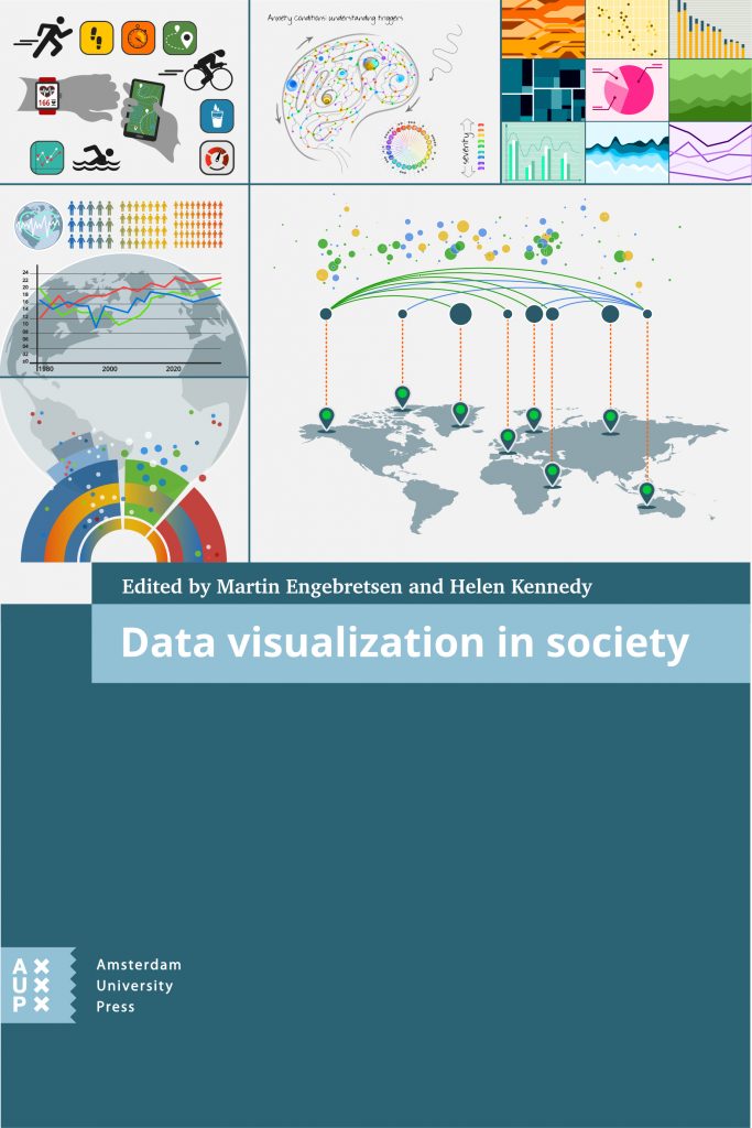
Data Visualization in Society is an open access book which will be published by Amsterdam University Press in 2020. It emerges from the INDVIL project and is edited by Martin Engebretsen and Helen Kennedy. The book addresses these questions:
- Where and how do citizens and publics engage with data visualizations, and for what reasons?
- In what new social and cultural contexts are data visualizations emerging, and to what ends?
- How do data visualizations create meanings in the various social and cultural arenas in which they appear, and what are their discursive roles and functions?
- How do data visualizations arouse feelings in their audiences, what kinds of emotional responses are activated, and to what ends?
- What does literacy mean when it comes to data visualization, and how can data visualization literacy be enhanced?
- What kinds of aesthetic characteristics do data visualizations have?
- What is the political significance of data visualization, andin what ways do data visualizations play a role in citizens’ participation in democratic systems?
INDVIL
INDVIL (Innovative Data Visualization and Visual Numeric Literacy) is a research project funded by the Norwegian Research Council, which runs from September 2016 to December 2019. The project explores data visualization as a semiotic, aesthetic and discursive resource in society. Professor Helen Kennedy is a CoInvestigator on the project, which is led by Professor Martin Engebretsen from the University of Agder in Norway.
Visit the INDVIL website to find out more.
Seeing Data
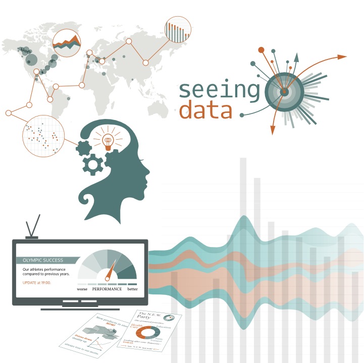
Seeing Data was a research project which aimed to understand how people make sense of data visualisations. It ran from January 2014 to September 2015 and was funded by the Arts and Humanities Research Council’s Digital Transformations scheme. It explored how people make sense of visualisations.
How do we interact with them? How do we interpret them? Do they help us make sense of data? Do different people interact with visualisations in different ways? What messages do we take away from visualisations?
Professor Helen Kennedy was Principal Investigator on Seeing Data.
Visit the Seeing Data website to find out more.